


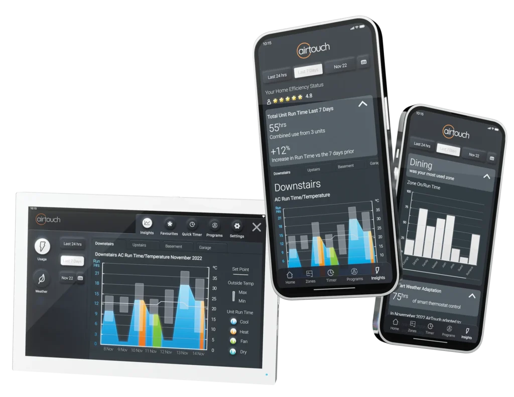
We want to help you identify if you could be wasting energy cooling or heating an unused part of your house. Graphs in any application are a powerful visual tool, and sometimes make important information very clear that could otherwise be overlooked if it was just numbers. The AirTouch 5 Insights tool provides a powerful visual graph to help you understand your energy usage better. By following the steps below, you can gain valuable insights and make informed decisions to optimise your energy consumption with your home’s AC.
Using the AirTouch 5 Insights Tool
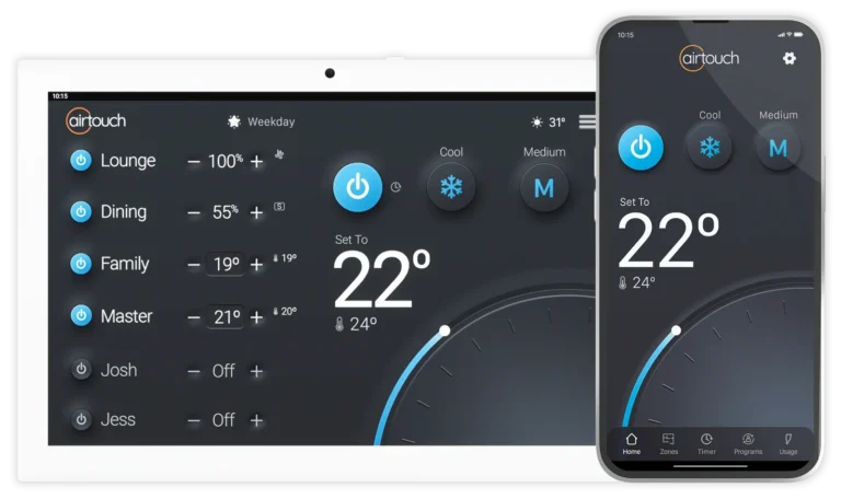
To begin, make sure you are at the AirTouch 5 wall console or have the AirTouch 5 app installed on your device.
The first step is to access the Insights tool. You have two options to do this:
Option 1 (Using the Wall Console)
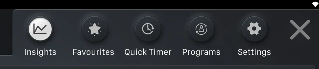
- Tap the Quick Menu on your AirTouch 5 wall console.
- Select Insights from the options provided.
Option 2 (Using the AirTouch 5 App)
- Launch the AirTouch 5 app on your device.
- Look for the Insights section and tap on it.
Choosing the Timeframe
Once you’ve accessed the Insights tool, you can choose the timeframe for which you want to review your energy usage with the tabs. The available options are the past 24 hours, 7 days, the current month, or choose a month.
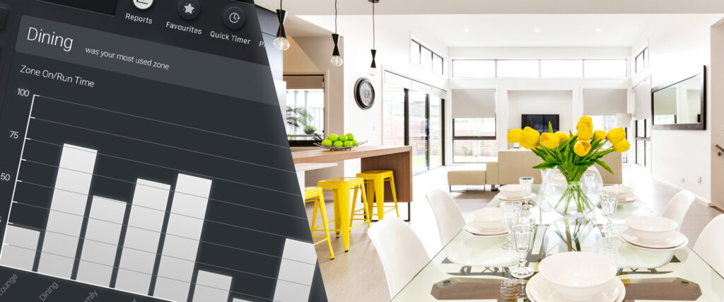
Accessing the Usage by Zone Graph
Scroll down through the Insights tools until you find the Usage by Zone graph. This graph displays a breakdown of the zones (rooms or areas) in your house and how much they’ve been warmed over the selected timeframe.
Interpreting the Usage by Zone Graph
The Usage by Zone graph provides valuable information about the zones in your house. The height of each zone’s bar represents the proportion of time it has been air conditioned during the selected timeframe.
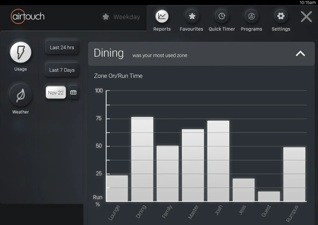
These are the rooms or areas that have seen the most energy usage with your cooling or heating.
Identifying Potential Energy Waste
Is one of them a room you haven’t used often? The graph is designed to help you identify this. Based on the insights gained from the Usage by Zone graph, you can take action to optimise your energy consumption during the season.
By using this tool often, you can take informed actions to reduce your energy consumption and help make your home more energy-efficient.
Stay tuned for more helpful hints and tips using your AirTouch 5! If you have any questions or need further assistance, refer to the AirTouch 5 user manual or contact customer support. Happy energy saving.